

CLIENTS

A PODCAST COVER IS A TINY BILLBOARD FOR A VERY BIG IDEA.
THE BRIEF
Building podcast brands that command attention before the first episode plays.
Every podcast has its own voice—and the branding should make it visible. The process begins with understanding the show’s audience and personality, then developing a logo, podcast covers and social media elements that feel distinctive and connected.
Working with Rina Broomberg and Podcast Party was an enjoyable opportunity to explore this exciting medium for branding.
01
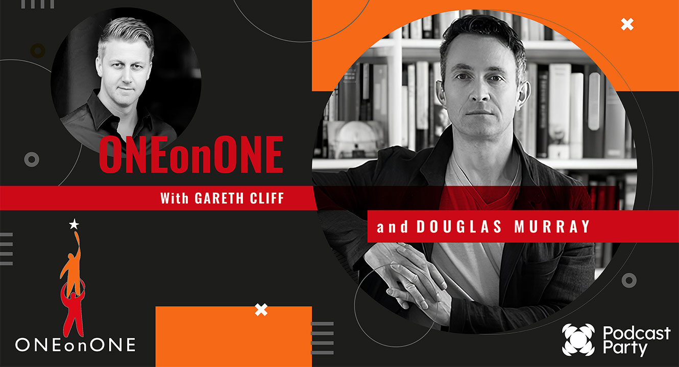
IDEAS · INFLUENCE · INTIMACY
ONE ON ONE
With Gareth Cliff, by Podcast party and OneonOne
Unfiltered, long-form encounters with people worth listening to.
The visual language is built around confrontation—in the best sense. Two portraits face the viewer inside an angular, editorial composition, while red bars behave like breaking-news straps. Black-and-white photography gives every guest gravity; the orange accents keep the series modern and unmistakably Podcast Party.
02
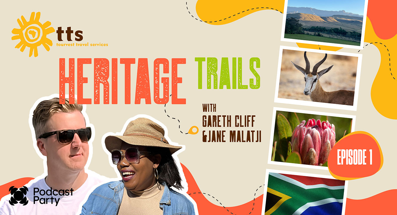
TRAVEL · CULTURE · DISCOVERY
HERITAGE TRAILS
With Gareth Cliff and Jane Malatji, by Podcast party.
A South African road trip told through the places, people and stories that shaped us.
The identity turns every episode into a page from a well-travelled scrapbook. Sun-baked colour, cut-out portraits, instant-photo frames and a wandering route line create a warm sense of movement and discovery. The design feels spontaneous—but the hierarchy stays strong enough to read at thumbnail size.
03
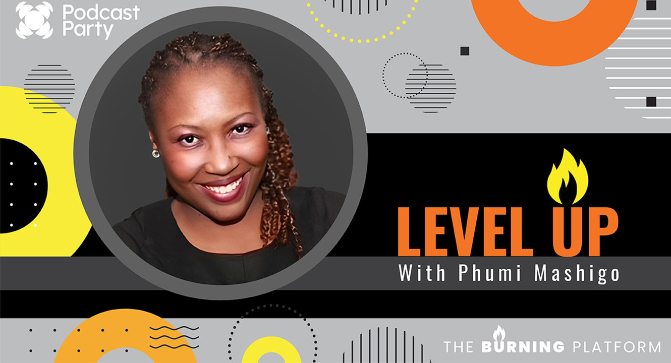
GROWTH · AMBITION · LEADERSHIP
LEVEL UP
With Phumi Mashigo, by Podcast Party.
Straight-talking ideas for people ready to move their work and lives forward.
Level Up balances professional authority with energetic optimism. A strong circular portrait, upward visual movement and a flame worked into the title create an identity about momentum. Bright yellow and orange cut through the monochrome foundation like a spark—bold, legible and ready to motivate.
04
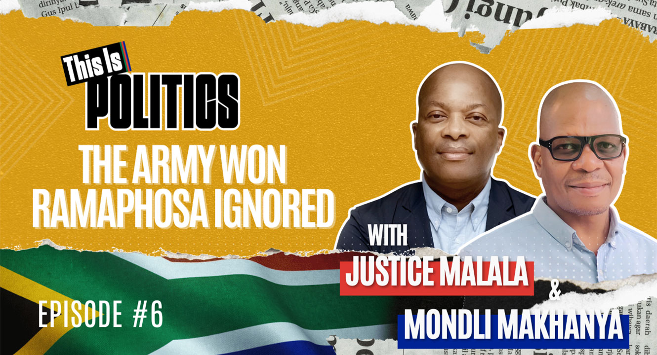
POWER · NEWS · SOUTH AFRICA
THIS IS POLITICS
With Justice Malala and Mondli Makhanya, by Podcast Party.
Sharp analysis of the forces, personalities and decisions shaping South Africa.
Politics is contested, layered and always in motion. Torn newspaper edges, a tactile paper grain and the national flag give the artwork the urgency of a front page of a newspaper. Oversized condensed type makes the episode proposition impossible to miss, while the portrait treatment gives the hosts a consistent platform across changing stories.
05
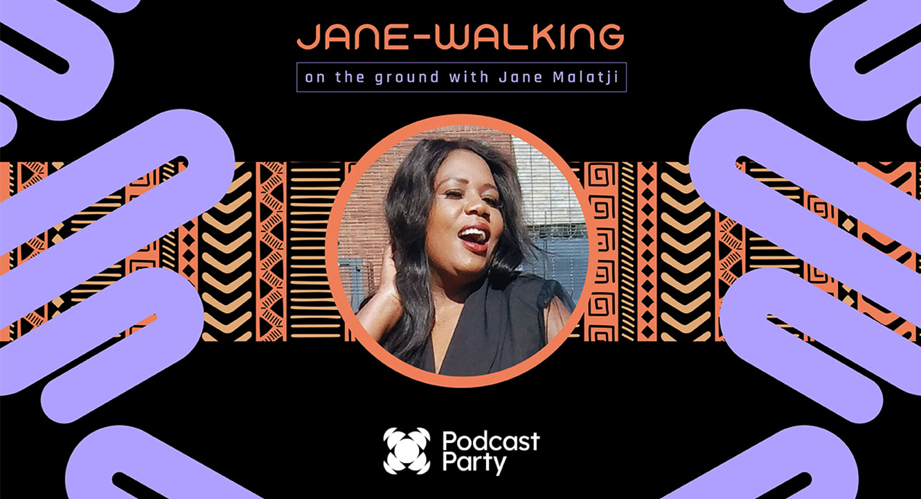
PEOPLE · PLACES · PERSPECTIVE
JANE WALKING
On the ground with Jane Malatji by Podcast Party.
Curious conversations rooted in real communities.
This brand needed the energy of a host who meets the world face-to-face. A centred portrait makes Jane the unmistakable guide, while expressive pathways and African-inspired pattern create rhythm around her. Coral and lilac bring confidence and warmth without losing the editorial edge.
06

Honest · Human · Unfiltered
Candid
Conversations
With Gareth Cliff, by Podcast Party.
Real voices, open dialogue and conversations that get straight to the heart of the story.
The identity needed to feel direct, energetic and unmistakably conversational. A bold microphone icon became the visual anchor, while electric cyan and vivid orange create confident contrast against black. Clean typography keeps the message clear and lets the honest, human nature of the show take centre stage.
HOW I CREATE DESIGN THAT ENGAGES
GREAT DESIGN EARNS ATTENTION.
STRATEGY MAKES IT STICK.
01
Listen before making noise
Every great brand starts with understanding the audience, the ambition and what truly needs to be said.
02
Find the big idea first.
One bold, ownable concept gives every colour, typeface and visual decision a clear purpose.
03
Make it impossible to ignore
The idea becomes a flexible identity designed to connect, spark engagement and stay memorable.
HAVE A STORY WORTH HEARING?